Menu
Menu
STYLE
“Less is more” is a statement made by the German architect Ludwig Mies van der Rohe and has become a symbol for design and furniture that focuses on the essential.
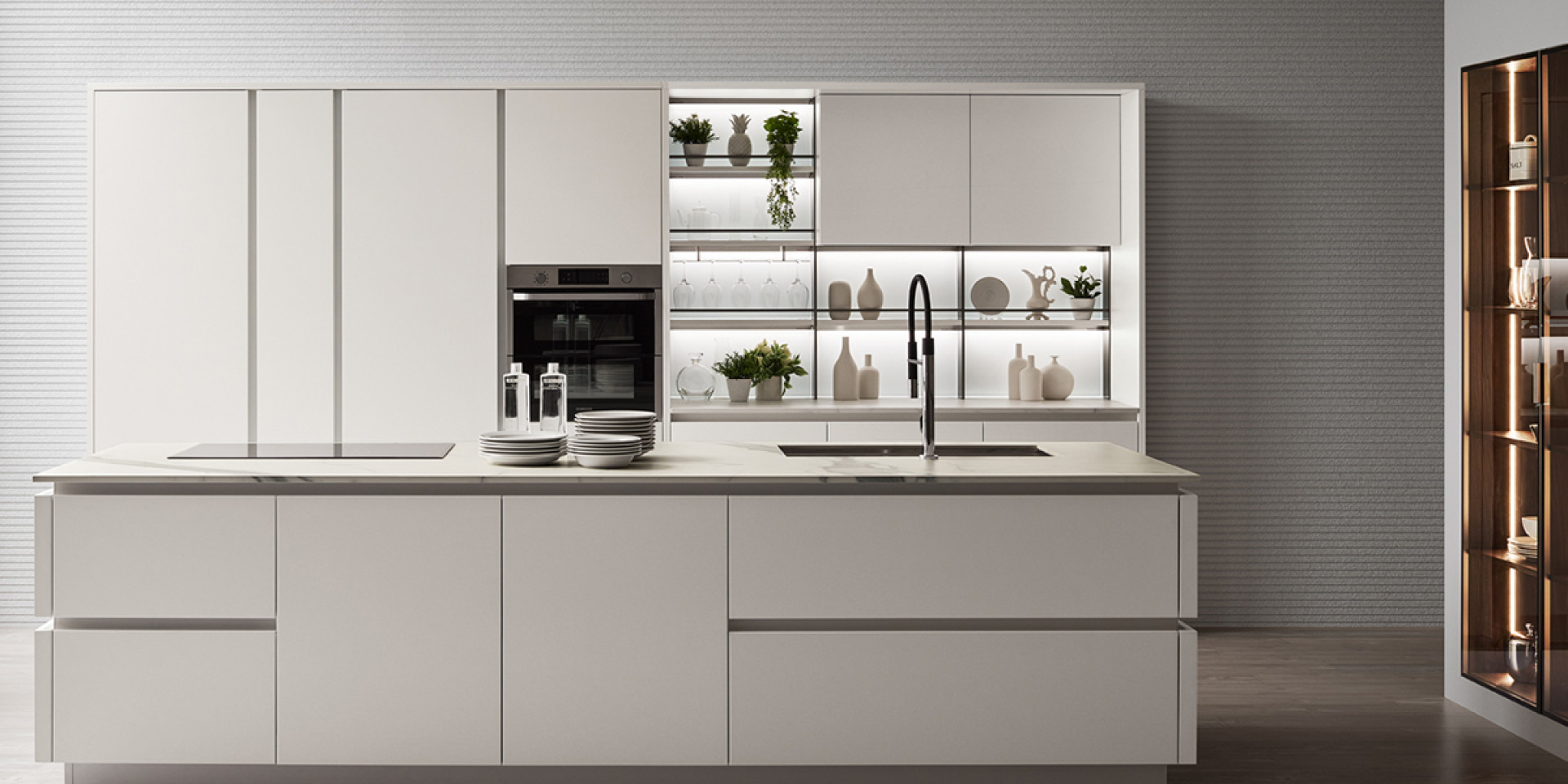
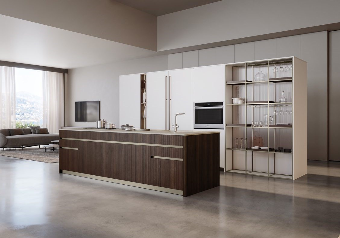
If you are looking for a sleek ambiance in your kitchen with an orderly, functional distribution of space – whether this be an island, linear, corner, U-shaped or T-shaped (also called central island) kitchen; if you love minimalist aesthetics and everything that conveys an impression of being clean, light and airy, then “less is more” is for you.
Traditionally, “less is more” takes the forms of smooth, monochrome surfaces, finishes and materials that give the room an impression of cleanliness and simplicity.
This does not mean foregoing decoration all together. Veneta Cucine’s Canneté finish for example, available on wood, glass and decoratives, can bring the texture to life whilst keeping both the material and the colour constant, forming a discreet and very interesting dynamism.
In minimalist modern kitchens following a “less is more” approach, extensive use is made of space-saving solutions aimed at reducing the complexity of the room.
Clear glass cabinets on wall units and columns help to tone down the volumes giving a greater impression of lightness.
Reducing visually does not necessarily mean eliminating. A hood, for example, can be concealed using a sophisticated trompe-l’oeil effect or by being built in, eliminates all disruptive elements in a linear arrangement.
Minimalism also focuses on the reduced use of colour; and of course in a minimalist style kitchen following a “less is more” approach, we cannot expect the kaleidoscope of colours that we would find in a wallpaper from the 1970s.
But we can also alternate a small number of colours using them as a signature; colour serves not only as decoration, it also helps identify different functions by making individual wall units and columns distinguishable.
Are you looking for a design kitchen where everything you need is at your disposal but nothing is over the top? Solutions in keeping with “less is more” characterise various Veneta Cucine products, all on display in our stores.
Visit the “Dealers” section to find the store nearest to you.


